Tuesday 5 June 2012

Rationale


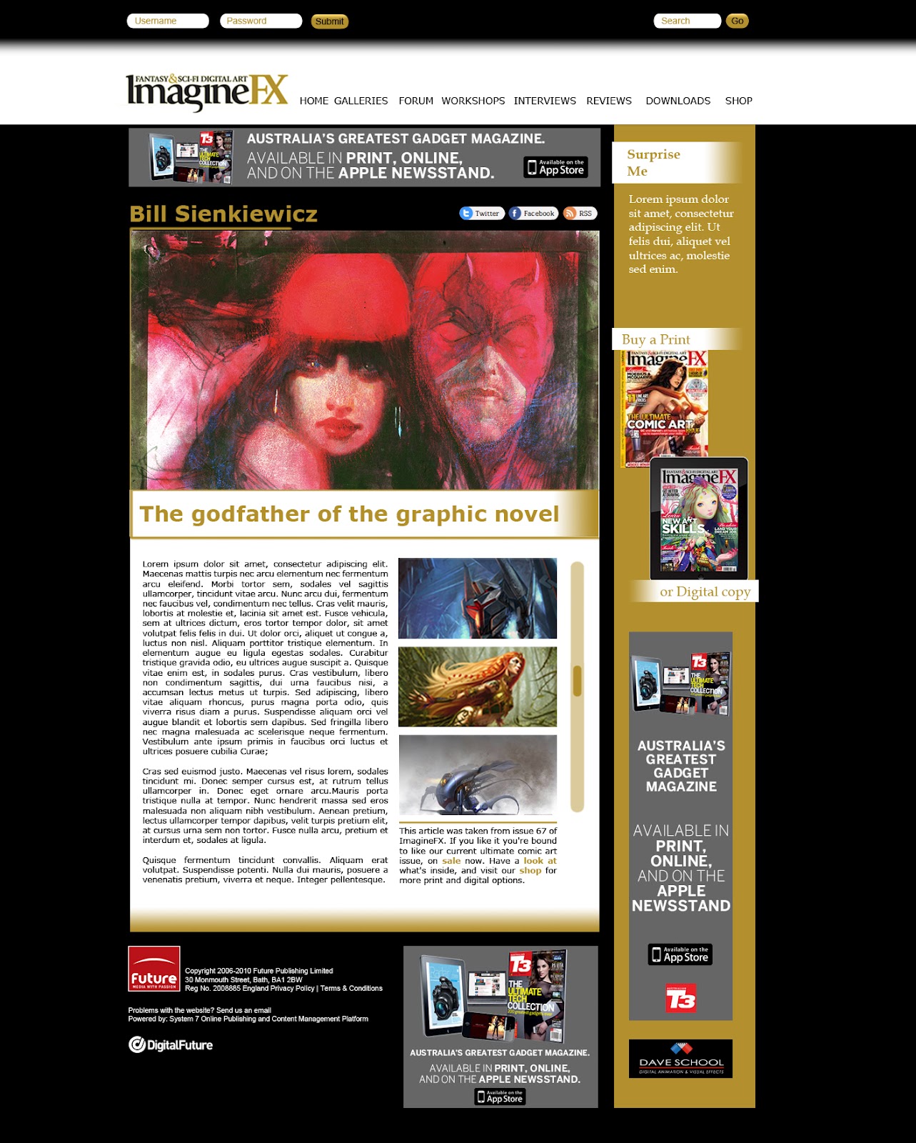
The final web design was made to have minimal focus on the layout and typography, and maximum focus on the images and content of the website. By using three colours - black, white and the Imaginefx Gold colour, I kept the website simple, consistent, and recognisable as belonging to the Imaginefx magazine image. By using two desaturated and one saturated colours, attention is focused more towards images without these colours - once again making images the stand out of the website.

The navigation is cleanly and simply stated at the top - there is a colour change on hover but other than that, it is extremely minimal but has plenty of space around the type. It stands out at the top of the page (unlike the original). The search bar is also on the top right. The Imaginefx logo has more space around it as well.

There is two main columns of content - used throughout the website design. The main body of content has any content relevant to the page category the user is on. The bar on the right holds the login information, basic magazine buying links and ads. The gold bar's contents rarely change. The main content always has a large picture featured at the top.  This means no matter where you are in the website, it is obvious what the website's primary function is - displaying fantastic digital artwork. On the homepage there is a small, simple slideshow that moves between the most important (and recent) areas of content. When javascript is disabled, a person is still able to view and click on these, however they are simply stacked one below the other. Below is other articles that have as much importance, but without the "new" factor, or the reverse - they are "new" but don't look impressive (such as reviews of hardware). These also have a simple hover effect over them. As this is a website about viewing images, I wanted it to be as instinctual as possible. By clicking on the image in a list (say from an interview or on someone's portfolio) the image appears using a javascript, and becomes the central focus of the page - without leaving the original webpage. You can then click on either side to go to the next/previous image or click anywhere off it to go back to the normal page layout.

Social media icons are included on most pages (excepting the portfolio pages, where these would get confused with the persons own social media links). The search bar and login are customised to fit in with the website's visual style, and don't stand out like sore thumbs. It is clear what their function is but they blend with the website's hierarchy.

By removing the added navigations, the text boxes of daily updates and forums and creating a simple and cleaner hierarchy of viewing, I have improved the websites legibility and functionality. In the original design of the website I was able to incorporate all the sponsored ads on the original website, however for the purpose of the assignment I removed a few of these.

Design Process

The design changes between the original website, my first layout design and the final look.

Homepage


Portfolio


Workshop


Gallery


Interview


Belated findings on user testing

I had two users test my website several weeks ago.

HomePage


Interview


Workshop (Or general list layout)


Portfolio


Gallery


Their main problems were with a lack of breadcrumbs, an unclear search area in the galleries section, and the use of a different link within the front page articles, that led to the general category, and not to the article itself. Their general feedback was that the website was clean and easy to navigate. One person commented that the website could be even more minimal, but understood that it was a website for a magazine that also and a substantial community, and therefore needed lots of up-to-date information being constantly processed.

1) NO Breadcrumbs


2) NO Portfolio Search area


3) Unnescessary links


Thursday 26 April 2012

Notes for css structuring:


Make in this order:
  1. Generic classes (body, a, p, h1, etc.)
  2. #header
  3. #nav-menu
  4. #main-content
Some pseudo classes:

  • :first-child
  • :link
  • :visited
  • :hover
  • :active
  • :focus
  • :lang(n)
General CSS notes:

Body: All the super general stuff:
 - Margin: 0;
 - Font: etc; (100%) then the paragraph/headers etc should be conveted to ems
 - Background: #etc;

#wrap: wraps all content.
 - Margin: 0 auto (if centering)
 - Width: etc;

Navigation

#nav: div class encompassing all of the navigation bar. 
 - background: #etc;
 - width: etc;
 - margin: etc;
 - padding etc
 - For navigation bar in a certain imagem use position:absolute; then define where you want it

#nav.clearfix:after  - class given to the ul in html doc
   content: ".";
   visibility: hidden;
   display: block;
   height: 0;
   clear: both;


#nav ul targets the list *as a whole* in the navigation div
  - margin: 0;
 - list-style:  (defines bullet points)
 - padding: etc;

#nav li - defines the list items as elements
 - float: left;
 - border (if wanted)
 - background (color if wanter)
 - margin: 0 1px 0 0; to give a bit of separation between elements

#nav a - targets the links
 - float: left;
 - color: of link in nav bar only
 - text-decoration: underline or not?
 - padding: extends  clickable area
 - display: block - allows padding to be set
 - margin: 0;

Structure

#header h1 - when using a image as heading
    margin: 0;
    position: absolute;
    height: 1px;
    width: 1px;
    overflow: hidden;
    clip: rect(0, 0, 0, 0,);


For content inside image:
make sure # is inside another #div (which will be the background later)
 - width:
 - background:
 -  position: absolute (keeps image at certain point)
 - right: etc px; - px from right
 - bottom: etc px; - px from bottom
 - padding: space from box edge to type;

for multiple elements that you want to float (say images) give them all the same CLASS and then specific ones, a space and then another class name
 - float: left
 - width
 - margins


Monday 23 April 2012

Font (Shorthand order)


Order:
font: style variant weight size/lineheight family, serif/sans-serif;

Optionals: style variant and weight (if used they must come before the size)
Line-height is also optional (and if omitted, remove /)

Required: Size, family and serif/sans-serif required - and must be in that order.

Revision


Unit sizes:
Can be:
- px size e.g. 1px
- em size - which is the default size of the browser times by the number (1.2em = 1.2*16)
- percentage size - 100% of the parent
- in/cm/mm - Measurement units equal to size of real life - can be used when determining size for printer.

Element selectors:

CSS - p { color: blue;}
Selects the element specified in selector
HTML - <p> Hero <p>

CSS -  .copyright { color: blue;}
Selects classes named "copyright"
HTML - <p class="copyright">copyright from 2010</p>

CSS - #wrap { color:blue;}
Selects ID "wrap" - only one ID per HTML document
HTML - <div id="wrap"> </div>

CSS - * {color: blue;}
Selects every element

CSS - img[src="image.png"] {border-color: red;}
**Check** Selects the item in the brackets - these can be just [src] or the whole value [src="image.png"]
HTML - <img src="image.png">

CSS - li > p {color:blue;}
Selects the second element only if it is a direct child of the first.
HTML - <li><p>hero</p></li>

CSS - li p {color:blue;}
Selects right handed element when a child of left - but doesn't have to be a direct child - value travels down the hierarchy
HTML - <li><div><p>hero</p></div></li>

CSS - h2 + p + div {color:blue;}
Selects attributes with these descriptors on the same level of hierarchy (for example, if they were all within the same div)
HTML - <h2> cat </h2><p>mouse</p><div></div>

CSS - a:hover {color:blue;}
Applies the value to the A attribute but only when it is "hovered" (or similarly described action is activated)
HTML <a href="hotmail.com>meow</a>

CSS - p:first-letter {color:blue;}
Targets the first letter of every <p> element

Tuesday 3 April 2012