Tuesday 5 June 2012

Rationale


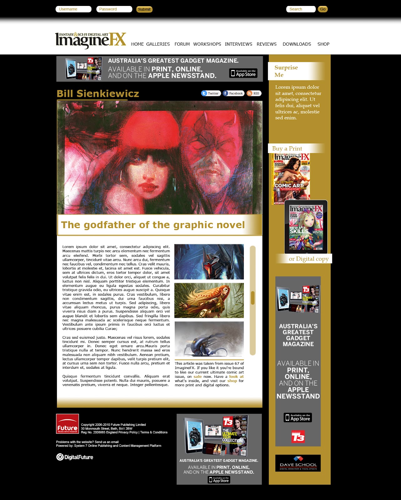
The final web design was made to have minimal focus on the layout and typography, and maximum focus on the images and content of the website. By using three colours - black, white and the Imaginefx Gold colour, I kept the website simple, consistent, and recognisable as belonging to the Imaginefx magazine image. By using two desaturated and one saturated colours, attention is focused more towards images without these colours - once again making images the stand out of the website.

The navigation is cleanly and simply stated at the top - there is a colour change on hover but other than that, it is extremely minimal but has plenty of space around the type. It stands out at the top of the page (unlike the original). The search bar is also on the top right. The Imaginefx logo has more space around it as well.

There is two main columns of content - used throughout the website design. The main body of content has any content relevant to the page category the user is on. The bar on the right holds the login information, basic magazine buying links and ads. The gold bar's contents rarely change. The main content always has a large picture featured at the top.  This means no matter where you are in the website, it is obvious what the website's primary function is - displaying fantastic digital artwork. On the homepage there is a small, simple slideshow that moves between the most important (and recent) areas of content. When javascript is disabled, a person is still able to view and click on these, however they are simply stacked one below the other. Below is other articles that have as much importance, but without the "new" factor, or the reverse - they are "new" but don't look impressive (such as reviews of hardware). These also have a simple hover effect over them. As this is a website about viewing images, I wanted it to be as instinctual as possible. By clicking on the image in a list (say from an interview or on someone's portfolio) the image appears using a javascript, and becomes the central focus of the page - without leaving the original webpage. You can then click on either side to go to the next/previous image or click anywhere off it to go back to the normal page layout.

Social media icons are included on most pages (excepting the portfolio pages, where these would get confused with the persons own social media links). The search bar and login are customised to fit in with the website's visual style, and don't stand out like sore thumbs. It is clear what their function is but they blend with the website's hierarchy.

By removing the added navigations, the text boxes of daily updates and forums and creating a simple and cleaner hierarchy of viewing, I have improved the websites legibility and functionality. In the original design of the website I was able to incorporate all the sponsored ads on the original website, however for the purpose of the assignment I removed a few of these.

Design Process

The design changes between the original website, my first layout design and the final look.

Homepage


Portfolio


Workshop


Gallery


Interview


Belated findings on user testing

I had two users test my website several weeks ago.

HomePage


Interview


Workshop (Or general list layout)


Portfolio


Gallery


Their main problems were with a lack of breadcrumbs, an unclear search area in the galleries section, and the use of a different link within the front page articles, that led to the general category, and not to the article itself. Their general feedback was that the website was clean and easy to navigate. One person commented that the website could be even more minimal, but understood that it was a website for a magazine that also and a substantial community, and therefore needed lots of up-to-date information being constantly processed.

1) NO Breadcrumbs


2) NO Portfolio Search area


3) Unnescessary links


Thursday 26 April 2012

Notes for css structuring:


Make in this order:
  1. Generic classes (body, a, p, h1, etc.)
  2. #header
  3. #nav-menu
  4. #main-content
Some pseudo classes:

  • :first-child
  • :link
  • :visited
  • :hover
  • :active
  • :focus
  • :lang(n)
General CSS notes:

Body: All the super general stuff:
 - Margin: 0;
 - Font: etc; (100%) then the paragraph/headers etc should be conveted to ems
 - Background: #etc;

#wrap: wraps all content.
 - Margin: 0 auto (if centering)
 - Width: etc;

Navigation

#nav: div class encompassing all of the navigation bar. 
 - background: #etc;
 - width: etc;
 - margin: etc;
 - padding etc
 - For navigation bar in a certain imagem use position:absolute; then define where you want it

#nav.clearfix:after  - class given to the ul in html doc
   content: ".";
   visibility: hidden;
   display: block;
   height: 0;
   clear: both;


#nav ul targets the list *as a whole* in the navigation div
  - margin: 0;
 - list-style:  (defines bullet points)
 - padding: etc;

#nav li - defines the list items as elements
 - float: left;
 - border (if wanted)
 - background (color if wanter)
 - margin: 0 1px 0 0; to give a bit of separation between elements

#nav a - targets the links
 - float: left;
 - color: of link in nav bar only
 - text-decoration: underline or not?
 - padding: extends  clickable area
 - display: block - allows padding to be set
 - margin: 0;

Structure

#header h1 - when using a image as heading
    margin: 0;
    position: absolute;
    height: 1px;
    width: 1px;
    overflow: hidden;
    clip: rect(0, 0, 0, 0,);


For content inside image:
make sure # is inside another #div (which will be the background later)
 - width:
 - background:
 -  position: absolute (keeps image at certain point)
 - right: etc px; - px from right
 - bottom: etc px; - px from bottom
 - padding: space from box edge to type;

for multiple elements that you want to float (say images) give them all the same CLASS and then specific ones, a space and then another class name
 - float: left
 - width
 - margins


Monday 23 April 2012

Font (Shorthand order)


Order:
font: style variant weight size/lineheight family, serif/sans-serif;

Optionals: style variant and weight (if used they must come before the size)
Line-height is also optional (and if omitted, remove /)

Required: Size, family and serif/sans-serif required - and must be in that order.

Revision


Unit sizes:
Can be:
- px size e.g. 1px
- em size - which is the default size of the browser times by the number (1.2em = 1.2*16)
- percentage size - 100% of the parent
- in/cm/mm - Measurement units equal to size of real life - can be used when determining size for printer.

Element selectors:

CSS - p { color: blue;}
Selects the element specified in selector
HTML - <p> Hero <p>

CSS -  .copyright { color: blue;}
Selects classes named "copyright"
HTML - <p class="copyright">copyright from 2010</p>

CSS - #wrap { color:blue;}
Selects ID "wrap" - only one ID per HTML document
HTML - <div id="wrap"> </div>

CSS - * {color: blue;}
Selects every element

CSS - img[src="image.png"] {border-color: red;}
**Check** Selects the item in the brackets - these can be just [src] or the whole value [src="image.png"]
HTML - <img src="image.png">

CSS - li > p {color:blue;}
Selects the second element only if it is a direct child of the first.
HTML - <li><p>hero</p></li>

CSS - li p {color:blue;}
Selects right handed element when a child of left - but doesn't have to be a direct child - value travels down the hierarchy
HTML - <li><div><p>hero</p></div></li>

CSS - h2 + p + div {color:blue;}
Selects attributes with these descriptors on the same level of hierarchy (for example, if they were all within the same div)
HTML - <h2> cat </h2><p>mouse</p><div></div>

CSS - a:hover {color:blue;}
Applies the value to the A attribute but only when it is "hovered" (or similarly described action is activated)
HTML <a href="hotmail.com>meow</a>

CSS - p:first-letter {color:blue;}
Targets the first letter of every <p> element

Tuesday 3 April 2012

Tuesday 27 March 2012

Notes for Self

Just making notes on readings issued in class:

Defining text size across browsers should take user zooming into account, and thus different ways of defining text size have been examined and one found to be "better" than the others across the main browsing platforms.

In summary of the first reading (found here):

Defining text in pixels: works across Safari and Firefox however Internet Explorer and Opera do not resize (unless using page zoom which magnifies all content)

Defining text in ems: When rendered in browsers, original size (before text size change) is identical to pixel size. However, IE6 and IE7 (whilst resizing) show an excessive degree of change.

Defining text using base of percentage: Using a base 100% and defining em differences in body text (etc) works across browsers, and a less pronounced difference in IE 6 and 7.

Verdict: Define Text size using percentage, then define differences using em values.

Taking line height into consideration

Line height should be consistent despite size of text throughout document to maintain rhythm. Thus we need to find a line height that scales with the text (when users change the size of text as a whole - but not when text size varies as a result of em value changes made by web designer).

Defining line height by pixel:
Specifing a unit stops the line-height being changed by text size em value. However, it is not scaled in IE6 and IE7 - so the text becomes squished.

Defining line height by em:
Em values are scales consitently across browsers, except for a monospace glitch in Safari.

So the proposed solution is a conditional comment programmed into the CSS.

a syntax [if !IE] is ignored by Internet Explorer browsers, and by defining a font size in pixels in here, the Safari browser renders as pixels and glitch is solved.

Monday 26 March 2012

Inspirational Webpage - Post 1

webpage at full screen size


I found this website when skimming some inspirational web pages and found this to be a possibly very useful way of keeping pages dynamic without annoying scrolling from side to side. It would be particularly useful for a website such as ImagineFx, which appears crowded and squished together - when a layout like this could keep the content at a focal point whilst retaining maneuverability.


webpage at half screen size

webpage at quarter screen size

Tuesday 20 March 2012

Summary of Document 2

And straight into second one:

CSS Line-Height

Line height can be specified in CSS like in Indesign. The default is around 1-1.2 in browsers. This can be overrided with a property (line-height: 100%; etc). It can be specified by different units such as normal, inherit, percentage, length-value, unit-less value.

They can also be used with the font-size in the following format - 12px/normal - the first being font size the second being line height. Line height is inherited by the parent property - so even if the descendants all have different font sizes, the line height is the same as the parent unless otherwise specified.

The exception to this is if the line height is specified by the "normal" unit value - which calculates the lineheight depending on the individual specifications of the font-sizes. However, this doesn't allow for much control. The "number value" entered is timesed by the individual font sizes for each child and calculated separately.

Summary of CSS document 1

We've been asked to summarise two documents given in class, I find this to be a fantastic opportunity to retain information.

CSS Inheritance

HTML is like a family tree, it has an overall parent - the html language, and tags that are descendents of this element. An ancestor is an element closer to this core parent (such as the body tag). A descendent is all the elements within that tag. A parent tag is directly above one tag - and a child is the element directly below. Like families, there can be many siblings that share te same parent.

CSS tells browsers how to interpret information about a HTML page - keeping style and content in separate documents.
There are 5 components - the "selector" which defines a rule for one element on a html page under the same tag - such as "p" - within the html document, any information within a

tag is effected by this rule. The declaration block contains the information about what and how the information will look. These changes in looks are defined by "property" values - the property to be effected is typed (such as color) and the value is the specific information (red).

Inheritance is when property values effects descendents of a tree. CSS allows a certain siblings to be effected and not others, by targeting these by creating a branch finder (specifiying a parent then child before the declaration block). However, only specific property's are inherited - some such as borders are not, as they would create borders within borders and make a gigantic mess - as the coder would have to specify that only the outer

tag is to be effected, by writing code to turn off the property for all the descendants underneath.

This can be used efficiently by making a general rule (property value) for a parent which would be inherited by the descendents. You can specify a specific child under that, and make an overriding rule for that child only.

---

Yes this is a very long summary, however I can't help but feel that the document I was summarizing off was already summarized... All of the information was extremely helpful. So for my own records and sanity I've written virtually everything in my own words - unfortunately messed up and confusing to some but I know what I'm getting at ;)

Sunday 11 March 2012

Other Media

I also found it interesting to look at the magazines when on other media - and see how well they adapt to the ipad. As a whole, it appears they don't use the full interactivity of the ipad - and appear to be merely copies of the magazines available on the ipad. Which can be a good thing, its cheap to do for one, however as these usually contain tutorials and interviews there are many more opportunities for video media to be displayed and integrated with the magazine, and also for the images to be displayed with or without information.


ImagineFx Spread

ImagineFx Cover

Digital Artist Spread

Digital Artist Cover

Digital Artist Spread

ComputerArts Cover

Saturday 10 March 2012

Analysing Its Art Mag


Navigation And Layout

The Its Art Magazine Website is very different to the other websites. The It's Art logo isn't displayed on the homepage anywhere. The top banner is a scroll through of major articles presented by the website. Underneath is a navigation bar, with minimalist social media icons. Underneath that is a third party banner, with an advertisement to join the It'sArt Facebook page tasked on the side. Underneath is a myriad of thumbnail images with information on roll over in varying sizes. The first group come under the heading "Gallery", the second "Videos" and the third "Tutorials". All the while, there is a bottom bar of social media icons, and interactions with the website.

For the remainder of the website, the layouts are inconsistent with little thought to layout and clarity.


Color

Color consists of white text on black or grey, there is also some blue gradients spread intermittently.

Typography

The descriptive text is clear to read however the navigation bar text could be more visible. The headings on the front page are crude and blend with the images behind.

Strengths


Looking at this website homepage it is immediately obvious that this is a website dedicated to showcasing digital art. The range and amount of images is impressive. The navigation bar is simple and efficient.

Weaknesses

The website isn't consistent, isn't easily navigated, and doesn't have a clear identity.

Analysing Digital Artist


Navigation And Layout

The digital artist website also has it's logo in the top left corner with an add right next to it. It has its login and register buttons above that on the left, and when selected make a drop down option where you can enter your details. In the same line, on the right hand side, it has the search bar. Below the logo is the navigation bar, with clear descriptions of pages (with drop down menus for select icons) and small, unobtrusive social media links next to it. There is also another, smaller navigation bar below that skipping to the products that the site sells.

Below this there are two columns. On the left, there is an image linked to the bar of "latest updates" located next to it - changing the image when your mouse rolls over the different links. Below this is the "Featured Images" with the add on feature of a slideshow. The image is also a link to the persons body of work. Below this is the "latest images" section, showing thumbnails of 15 images and a link to more. Below this is the image categories, (showing works of a specific technique), image genre (search by specific genres), editors choice and top rated galleries (links to specific galleries). Below this is another ad, and the very bottom of the page exhibits a series of related links and contact information.

On the right column is a sign up icon, with site statistics below, an ad, a bigger news and features feed, a twitter feed, a tips and tutorials feed and a resources feed.

When looking at another page, specifically the "about us" page, it appears poorly considered. There is an extremely long scroll with massive gaps of white between content. The layout is very different to the rest of the site, with different icon language and structure.

Color

Color consists of light grey text on black, white on blue and black on white. Also green and pink are used very sparingly.

There is inconsistency with color however. The navigation bar at the top keeps everything blue, however in the roll overs just below the headings change color. Some links are blue, some are in bold and some have a bar of color behind them. The headings change from white on black to black on white, and the colored splashes behind the type is inconsistent. There are also some green buttons.

Typography

Typography wise, there is a bigger distinction between sub-headings and content, however looking at the "above the fold" page, there is only one heading visible. and your eye has no type hierarchy to follow. Similar to the imaginefx page, the type on the ads stand out more than the type on the website itself.

Strengths

The page has more breathing space, with bigger gaps between boxes of content to create distinct separations between content/services. More images on front page create immediate understanding of what the website is about. Clear "About us" page, and unobtrusive social media icons.

Weaknesses

The page doesn't present a clear identity, and it isn't continues on to the other pages. It's positioning of elements isn't consistent with it's services and content. It attempts to use too many different drop down/pop up/roll over devices.

Analysing Computer Arts


Navigation And Layout

Computer Arts like the others has its logo on the top left, but also has a tag-line (which imagine-fx also has but digital artist doesn't). There is a search bar and log-in bar in the top right. Underneath is an ad, and under that a clear navigation bar. The page is then divided into two columns.

The first item in the left column scrolls through four of the latest articles, with roll over highlights. Just below it there are three columns of more of the latest feeds - each with image, title and very short description, all with roll-over highlights. These also have a small tab indicating what service the article is from - blog, tutorial, feature etc.

The right column has a small ad for subscribing to the mag, with social media icons elegantly placed below. Underneath is the newsletter tab, then another ad. A small block underneath shows a list of the "most popular" articles viewed. Underneath is an ad banner, and next to that the three major selling items of computerarts - unfortunately appearing as another banner themselves. Tucked under these ads is the "popular tags" box, with facebook and twitter boxes under that.

A contact us, other information sections and about us links are placed very simply down the bottom of the page, and do not draw unnecessary attention to themselves.

Color

Color consists of black text on white background, with minimal amounts of white text on pink.


Typography

There are clear headings for each of the articles, but these are bigger and more attention grabbing then the division headings. In this instance, where the articles don't necessarily need a heading as this is self-explanatory, this is a good thing.


Strengths

Throughout the website the design is consistent, with color, type and similar layouts used throughout. The content is well framed, well positioned and clean. It has division space between items, and isn't cluttered. It is an engaging design with simple yet effective interactivity.

Weaknesses

Important information such as subscription and the three main products appear as ads and are generally ignored by the viewer.